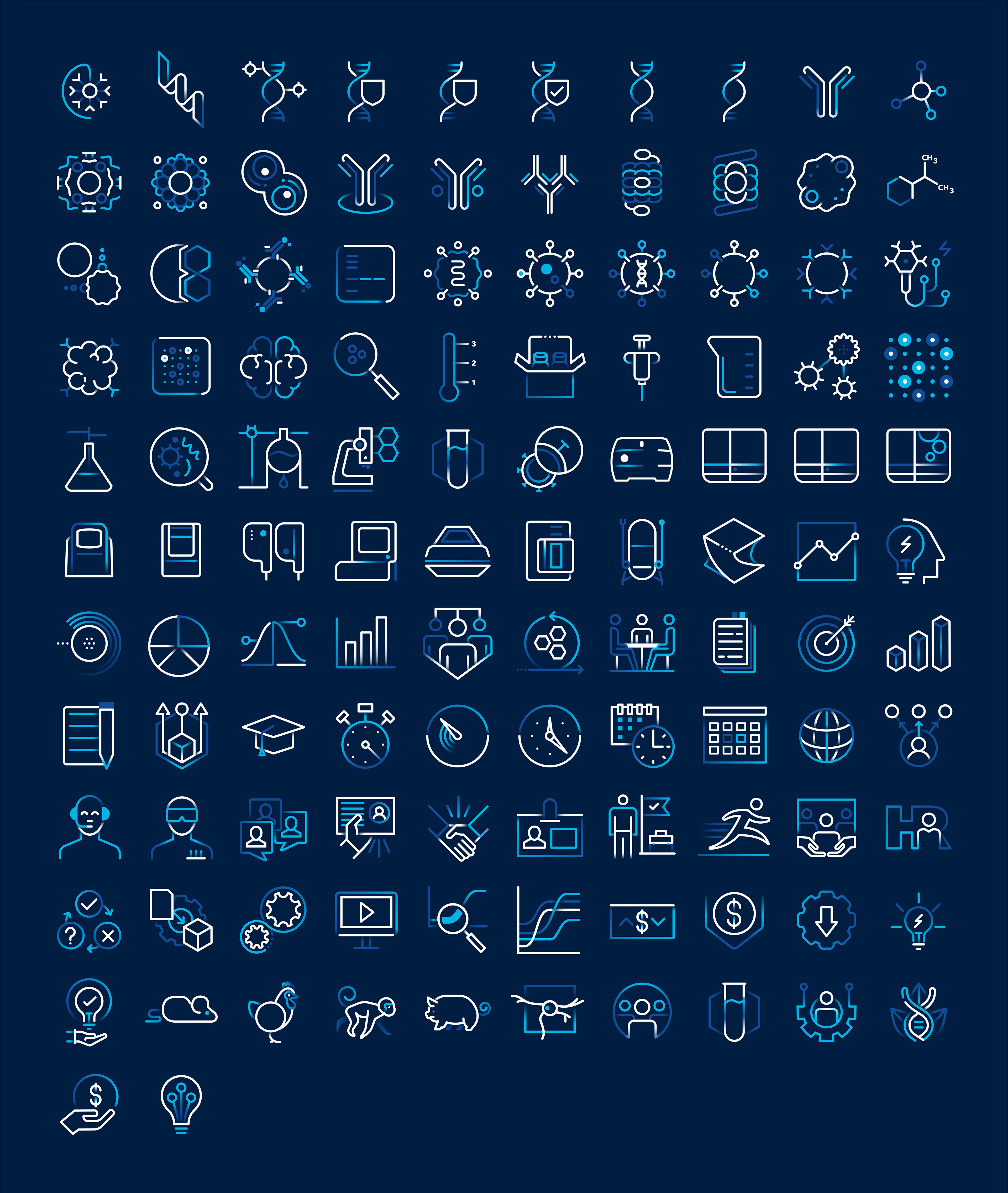
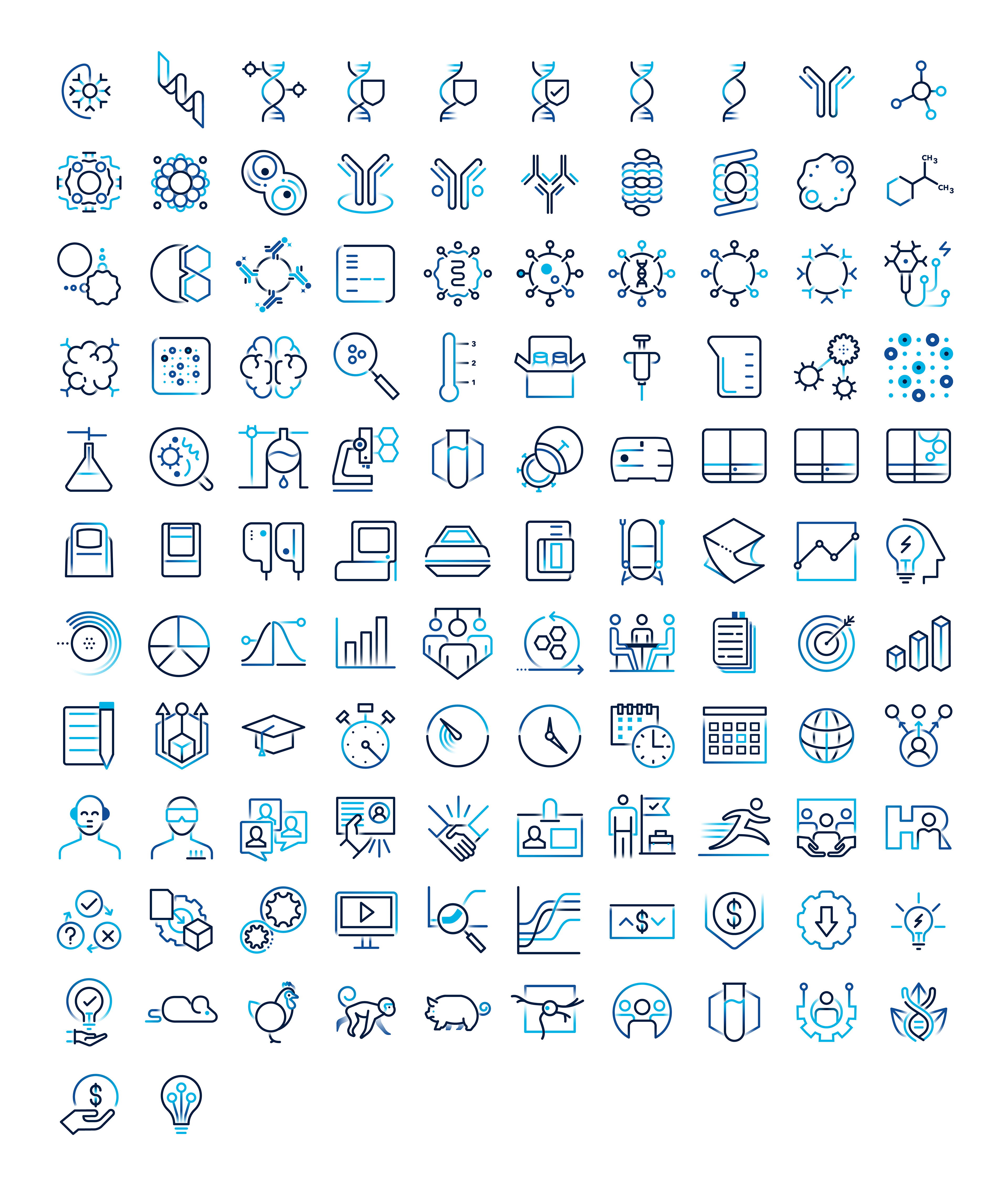
BIO-TECHNE
Branding | Print and Web
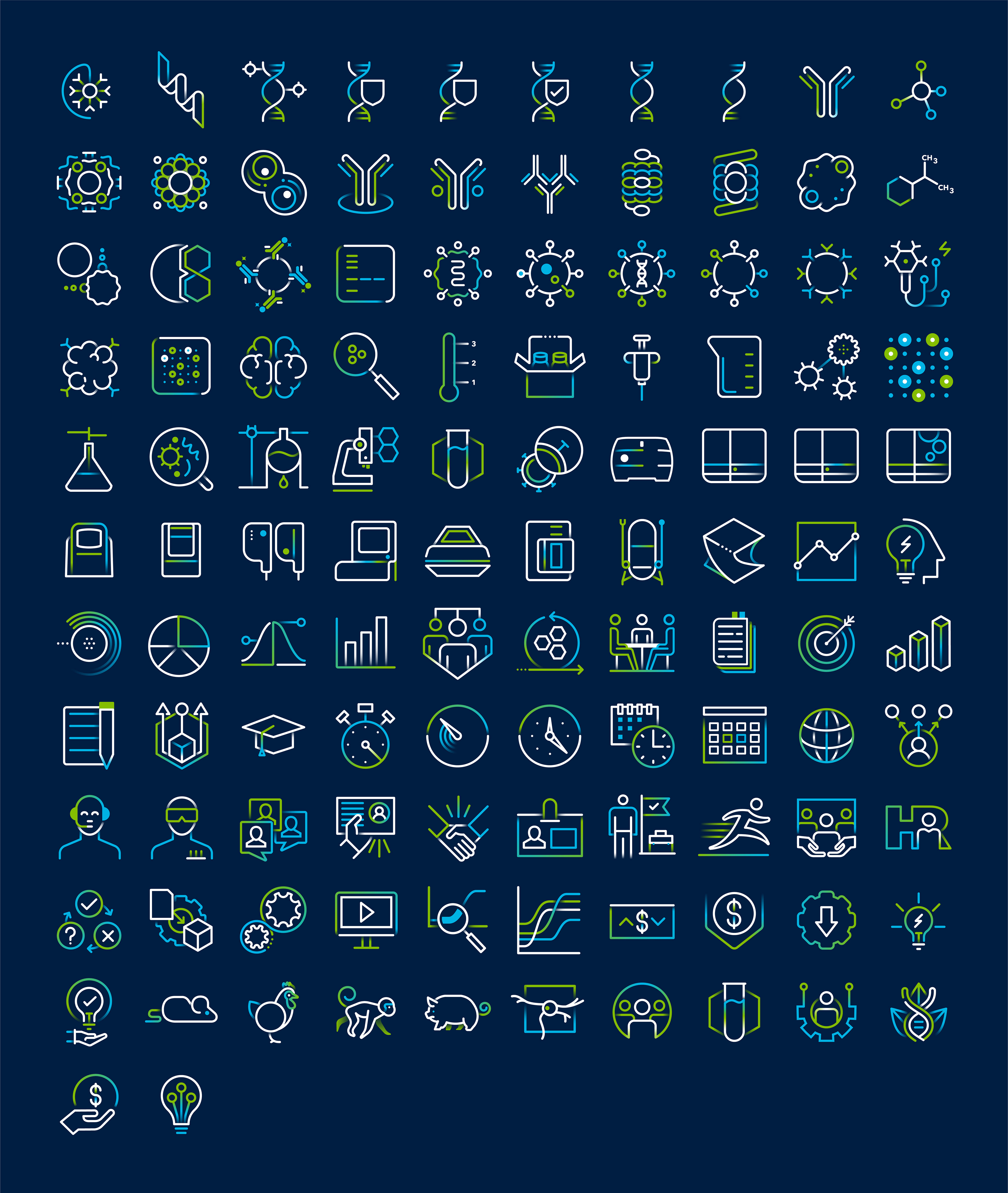
Bio-Techne refined its brand further to a more high end style promoting cleaner line work and heavy use of minimalistic ideology. In response I looked ahead at where Bio-Techne is going and proposed further refinement of its iconography in order to accommodate smaller screen sizes to favour mobile and app support, and its ever growing focus on motion graphics both linear and interactive.
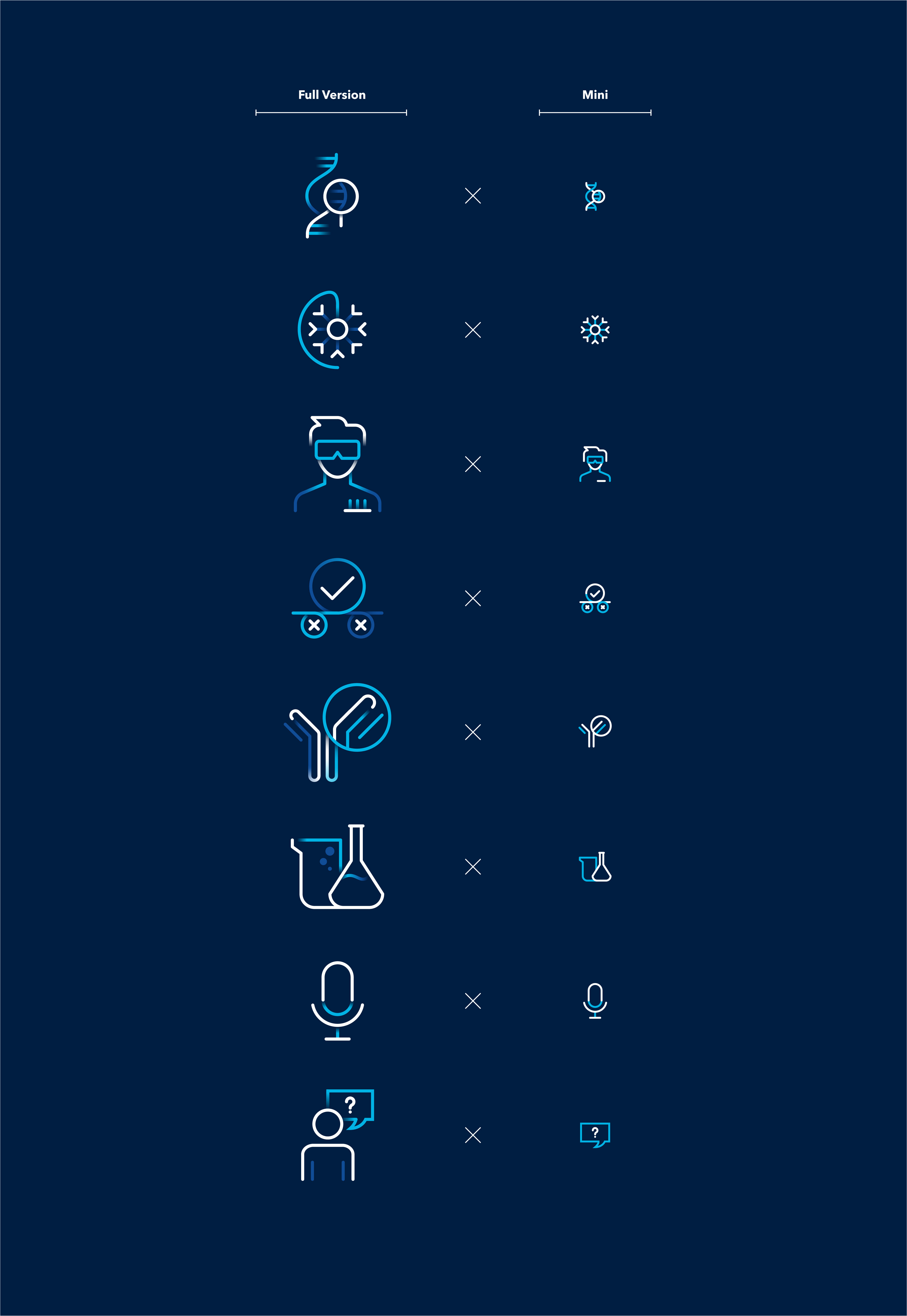
MINI VERSION
Scaled for UI and small scale digital/print application.

LIGHT MODE
GREEN & BLUE VERSION