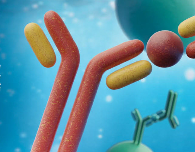

BIO-TECHNE
Branding | Print and Web
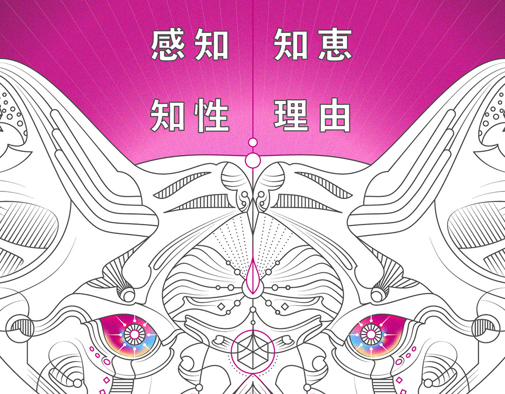
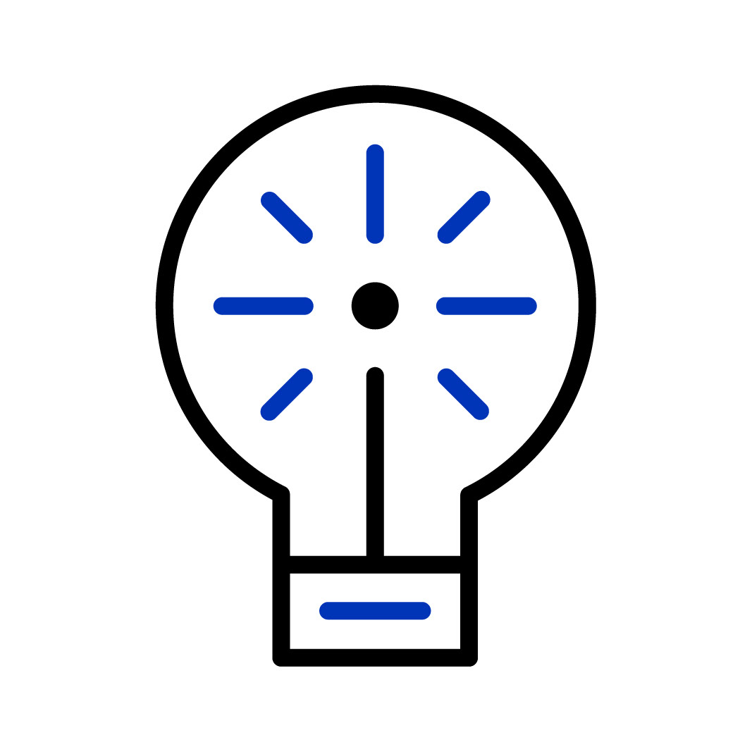
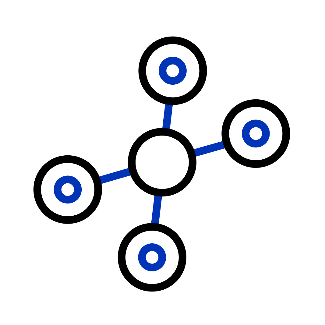
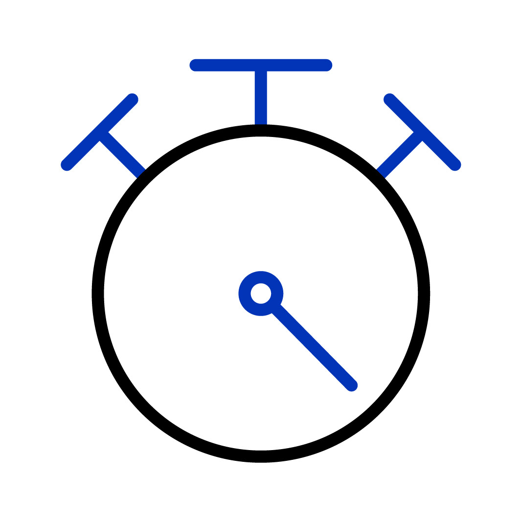
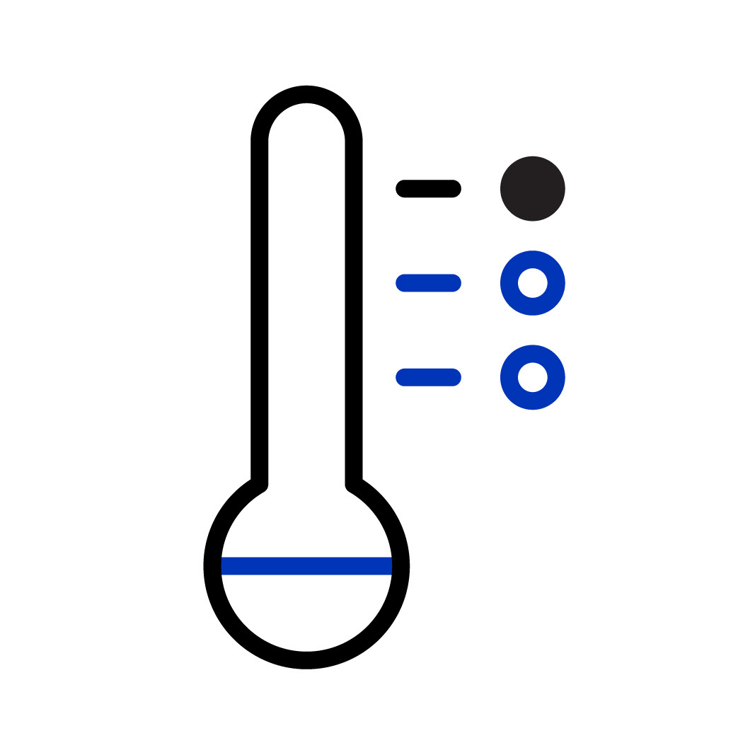
As the core branding team worked on an extensive reimagining of the Bio-Techne team, I worked closely with them to define a distinctive and slick iconography library to strengthen the brands communication style.
As technology is rapidly evolving as described in Moore's Law, I factored in current and future resolutions, platforms, interactions and brand presentation; alongside creating iconography that can be used in conjunction with scientific phraseology; all delivered in an easy to access archive for Global employees including the core design team.
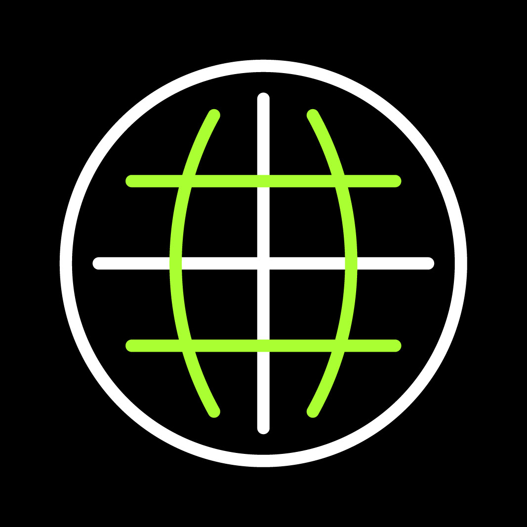
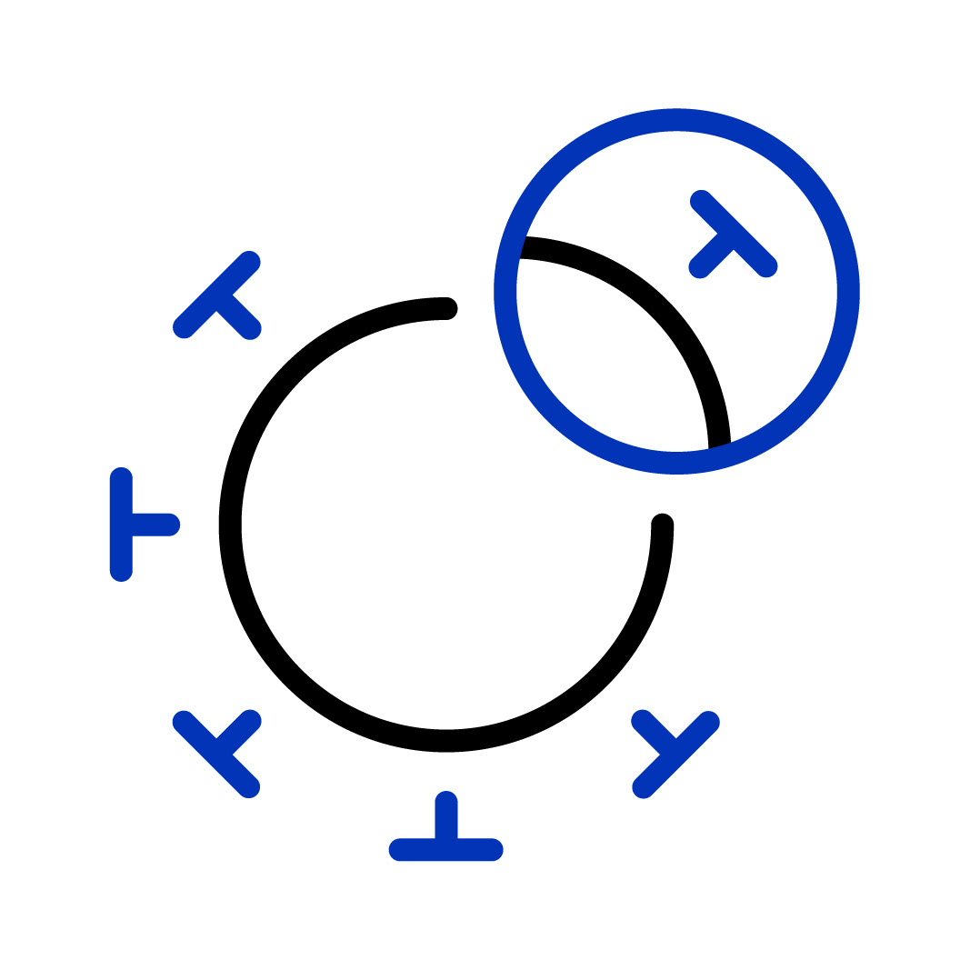
// SET PREVIEW // DARK MODE //


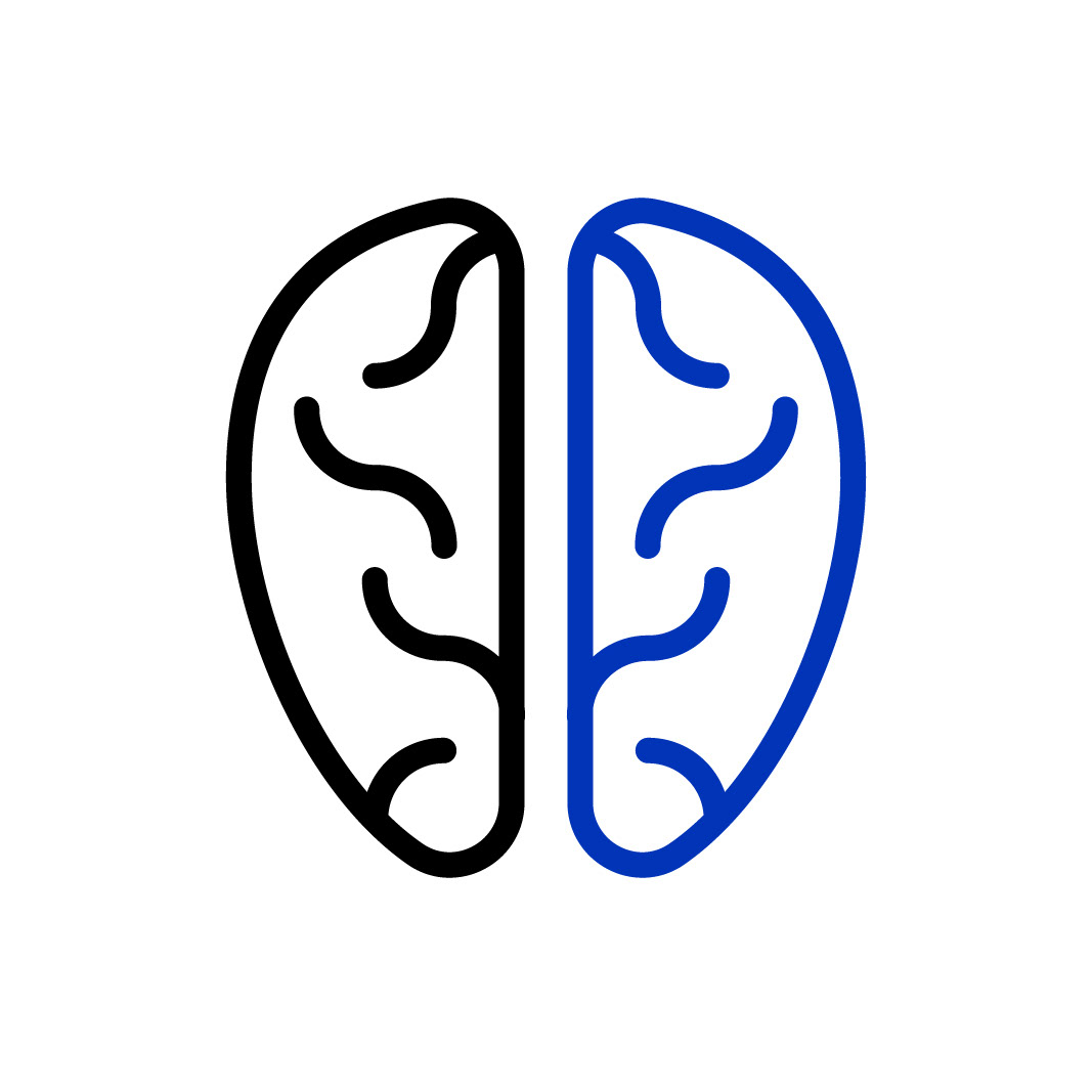
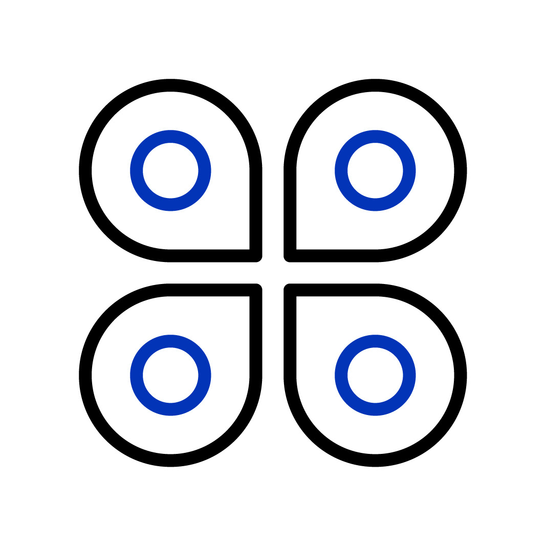
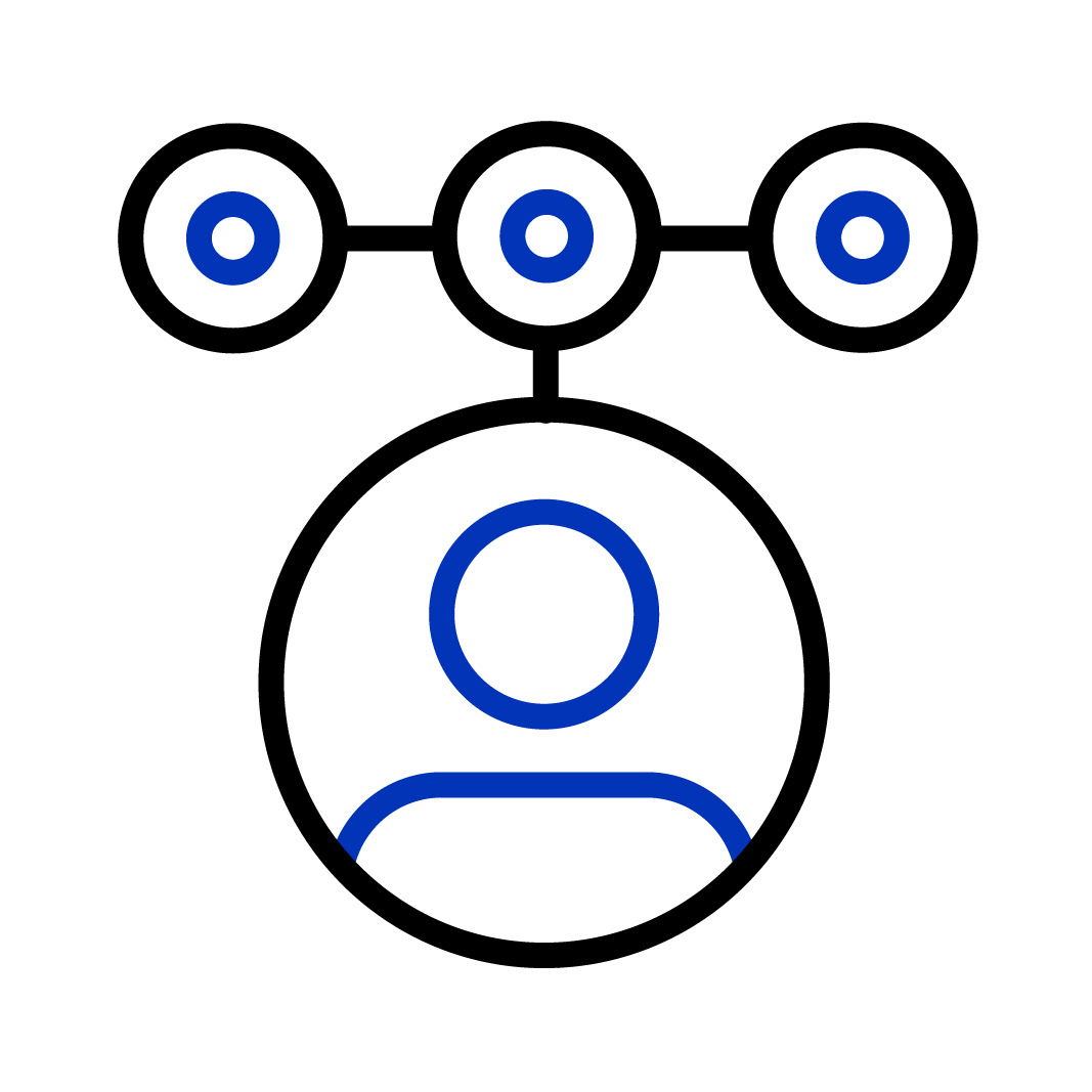
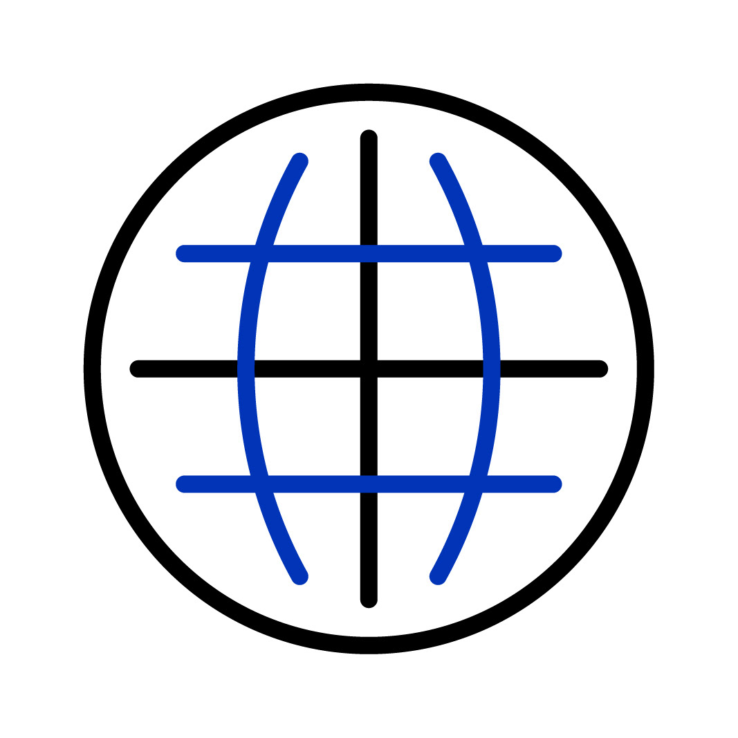
// SET PREVIEW // LIGHT MODE


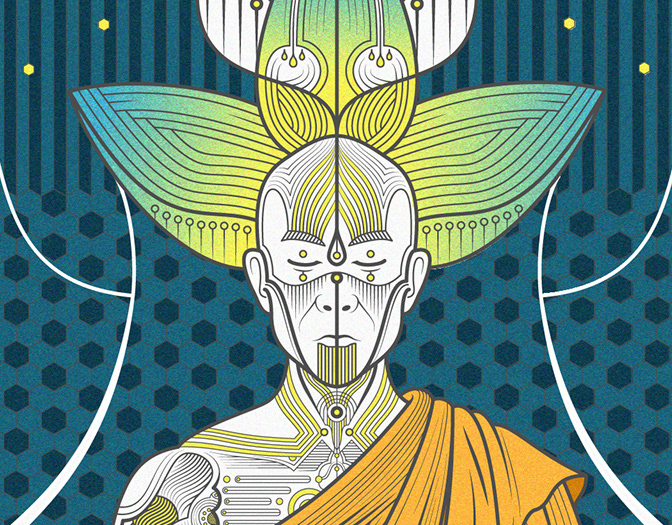
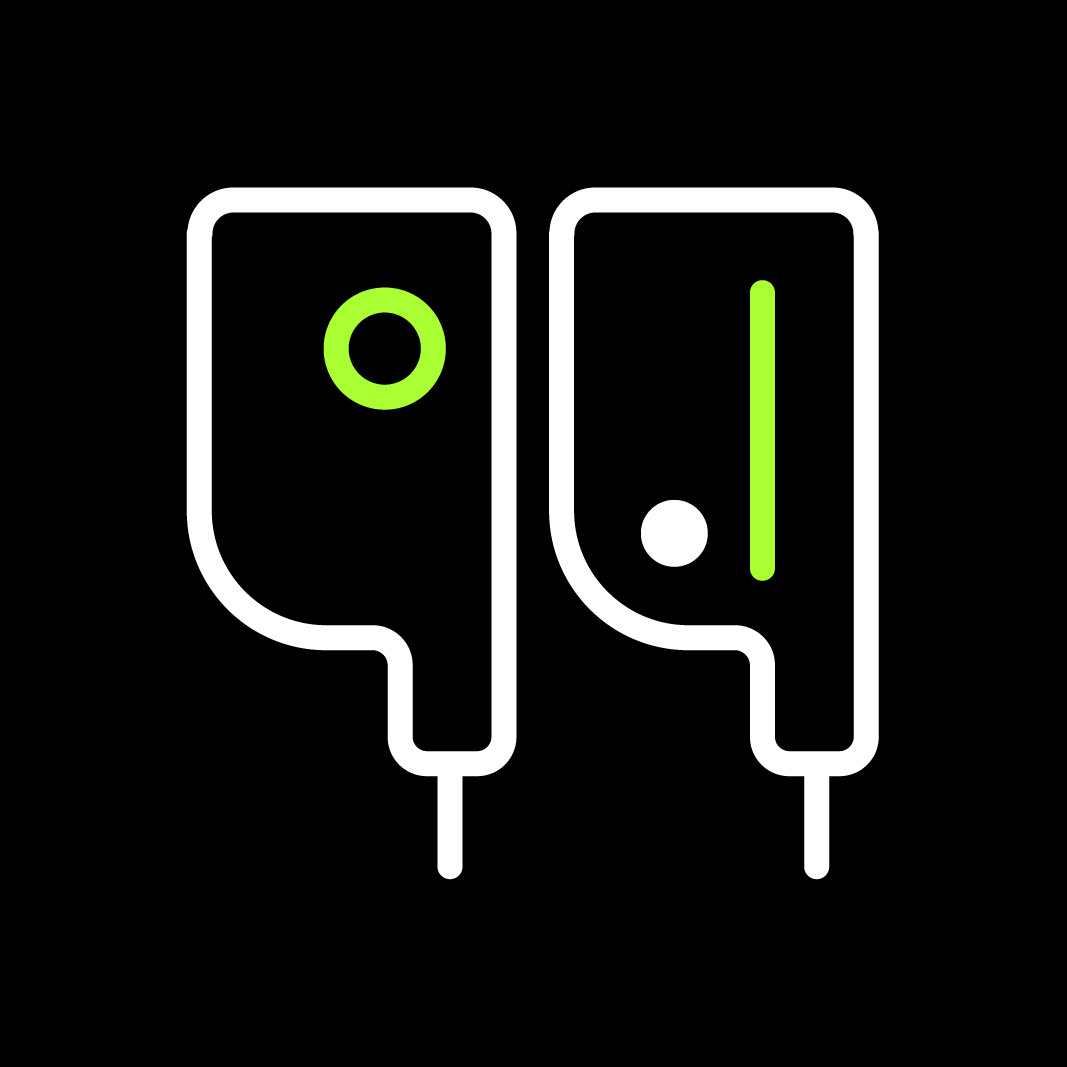
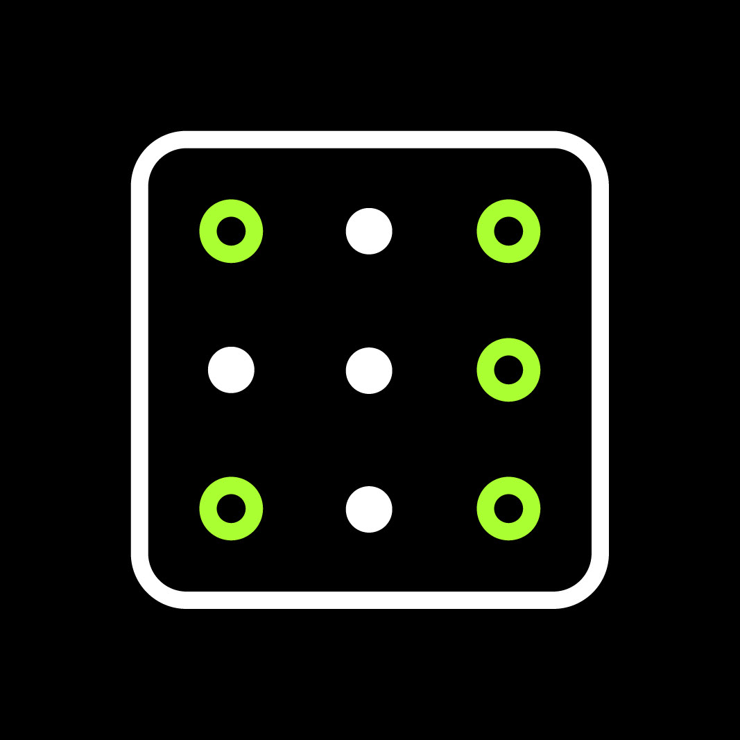
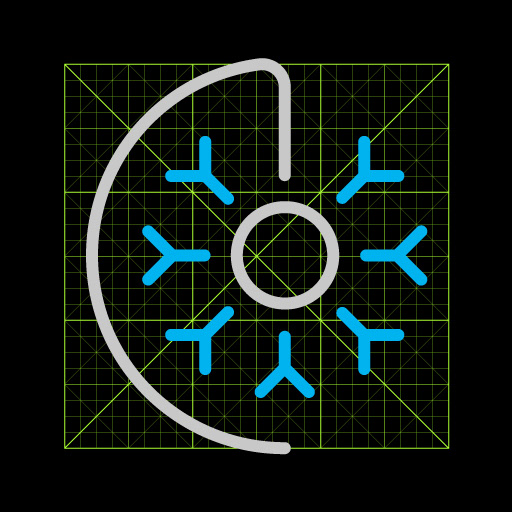
// BUILD SYSTEM //
As we had a vast library of icons already made for the previous version, we needed an iron-clad build system to ensure any of the core iconography team can build new icons that immediately achieve the high level of refinement and style of our core set. For this we defined the core principals of our iconography, and broke them down into a grid system that balances detail and simplicity. With the grid as a core tenet, we are able to consitently build custom icons with minimal design tweaks which has made the entire build process far more efficient.
To share the conceptual and build process with other experienced designers has been a privilege, to learn from others and share your learnings in return is one of the most enjoyable flows in design.
More icons will be added to the 3.0 release as we roll through milestone releases.


// ICON EVOLUTION // 1.0 // 2.0 // 3.0 //